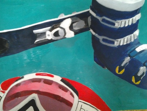
My final turned out pretty well, although I did feel a little rushed in trying to finish so it's a bit sloppy. The book, for instance, isn't very need while the glasses and skis are because I started with those. I kind of feel like the objects don't feel connected. They're all obviously related but the composition of the piece wasn't very well put together. The skis and boots are just to far away from the goggles, so the goggles seem like they're out of place a bit. Overall I think it looks pretty good. I like the colors I chose and, despite the fact that's its a bit sloppy it turned out pretty well.
For my painting, I decided to use this picture Monument Valley. I tried one other desert-y landscape and decided I liked this one better. The first one had one of those rocks that's in the middle of this one up close and on the left with more in the background. I figured it'd be easy to show how they got less detailed as they got farther away, but the landscape was really boring to draw, so I didn't think I'd want to paint it. The second draft I did was of this picture which was taken in Monument Valley. It's the first picture that comes up if you Google the place. I liked this one better because it was more interesting. Instead of only rocks taking up the picture there was also this random piece of wood in the front. This allowed to to pay a lot of attention to the detail in the piece of wood, like all the lines and colors, and let the rocks in the background be less detailed chunks of color with some lines. This is the one I based my final off of. This assignment was to make a landscape painting using either watercolor or acrylic paint. The paintings are going to go to some people who donate the art program every year. We're allowed to do any landscape we want. The background is supposed to be much more out of focus, like real life. Not like Bob Ross.
I decided to do a desert-y landscape. After looking around a bit, I found a picture of Monument Valley. I liked the blue and brown co Charcoal: The charcoal drawing turned out fine. I really like working with charcoal, although I don't do it often. I ended up turning the picture upside down to try to make the form and proportions accurate.
Chalk Pastel: I've only ever used oil pastel before, so using chalk pastel was kind of weird. Overall I think the portrait turned out well. I wish I had tried to make the colors more vivid, but I had run out of time. Overall, this project turned out alright. It wasn't a very fun project, but did make me focus more on form than detail so I guess that's good. I made four drafts in all, three in charcoal, one in chalk pastel. The biggest issue I faced was trying to put everything in the right place. It was really odd not to have the normal look of a clear picture to draw. Instead, I had do focus on the vague, general positioning and size of the sections of color. I think the charcoal sketches turned out pretty well, even if they do look really weird.
The pastels were fun to use. I didn't realize we weren't using oil pastels, so once I found out that was a relief. Oil pastels are kind of a pain. I only did one sketch in color because I had already practiced the composition with the charcoal. I had just wanted to get a feel for the pastels. Starting with the light was kind of awkward because it meant I couldn't start with my hair which gave some sense of structure for me to draw the rest of my face with, but it turned out better than expected. When Mr. Meserve told me I'd be doing two more self portraits, my only thought was "Crap, noses, again." However, this time, the self portraits are going to basically be blobs of color. The pictures are going to be so blurry that there will basically just be fuzzy chunks of different values. One portrait will be in black and white values using charcoal, the other will be in pastel. I'm excited about using charcoal again. Although it's ridiculously messy, it's a lot of fun to use. Pastel, on the other hand, is not something I'm looking forward to. We used pastel ones before but the drawing turned out pretty terribly and pastel is just a pain to work with. So that'll be fun.
For my final, I chose a green/yellow color scheme. When I thought of confusion/thinking those were the colors I thought of, and so did other people I asked.
This was my first time trying to paint with actual water colors, not the crayola watercolors you paint with when you're in elementary school. Figuring out how to get the hue of the color I wanted was difficult at first, and I failed to water down the color enough at first, but after I got used to it the project went a little smoother. I don't think it looks very good. It's really weird and not in the good abstract odd way that I was hoping for. But on the bright side, I figure this was an interesting learning experience. Yes, it looks weird and strange but if I have to do another portrait in watercolor in the future, hopefully it'll turn out better than before. So after deciding on the photo I was going to use, I started on my draft.
Now, I rarely draw people so it was a bit of a challenge to draw myself, but I'm okay at drawing people. I actually only have one draft. Technically, I probably should have done more than one, like two or so, but I just didn't really want to. It took long enough to take one decent picture conveying an emotion, I didn't want to spend an entire class period trying to take a another. And I wasn't just going to draw another draft of the exact same picture, because that's just kind of silly. The drawing turned out better than I expected. There were definitely some improvements that could have been done, but it's pretty close to how I wanted it. The only real problem I encountered was the freaking nose. Most people say eyes are hard, and they are, but noses are obnoxious. There's no hard line or anything to really define the shape and you have to line up the nostrils to get them in the right shape and blah. They're incredibly frustrating. After procrastinating on the nose though, I did get it done with some help from Mr. Meserve. I started my final today and got through getting the basic shape of the head and hand, then adding details to the eyes and lips. The nose is still being put off though. I'm planning on using watercolor for my final, but I've never actually used watercolor out of a tube before, so this should be an interesting learning experience. So our first assignment in advanced art is to choose an emotion and create a self portrait showing the emotion we chose. I started by compiling a list of emotions I thought might be interesting to do. I finally decided on confusion, as it's an emotion a lot of people feel, makes an interesting face, and has been something I've been experiencing a lot lately.
I spent the entire first period after we got this assignment just trying to capture the emotion. In the moment, showing confusion is easy. But pretending to be confused to get a picture of yourself is difficult, especially since the emotion needs to be kind of exaggerated. I finally decided on a picture which kind of looks confused, and kind of looks sad I guess. I'm not really sure, but it works. I started the first draft on the second day to try to practice drawing my face, which isn't something I really ever do. Sure, I've drawn random people out of boredom but I rarely try draw myself. The draft ended up looking fairly good though, so that's good. Alt |
AuthorWrite something about yourself. No need to be fancy, just an overview. Archives
April 2013
Categories |